UX/UI Design
Framer

Hero section
The headline addresses the biggest fear buyers have about AI tools: losing their brand voice and flips it into a benefit in one line. The badge above removes the two most common objections before they form. Two buttons capture both the ready buyer and the skeptical one.
The dashboard below does the rest. Real metrics, a downward resolution time curve, and a "Flowdesk activated" annotation tell the product's story before the user scrolls anywhere.
Each element enters with a smooth fade-in animation on load. The staggered appearance gives the hero a sense of polish and makes the content feel intentional rather than static.
Features section
Three cards, three core problems solved. Each card pairs a UI mockup with a short description, showing the feature rather than just naming it.
The section is interactive: a progress bar at the top of each card counts down automatically, then switches to the next feature. The user can also click any card manually to jump directly to it. This keeps the section alive without overwhelming the visitor with three blocks of content at once, they see one feature at a time, in focus, with full attention.

How it works section
Three steps, three cards, one clear flow. The middle card is intentionally larger and darker, it's the product's core action (Reply) and deserves the most visual weight.
Real photos instead of illustrations make the steps feel grounded in actual workplace scenarios rather than generic SaaS imagery.
Pricing, FAQ, CTA & Footer
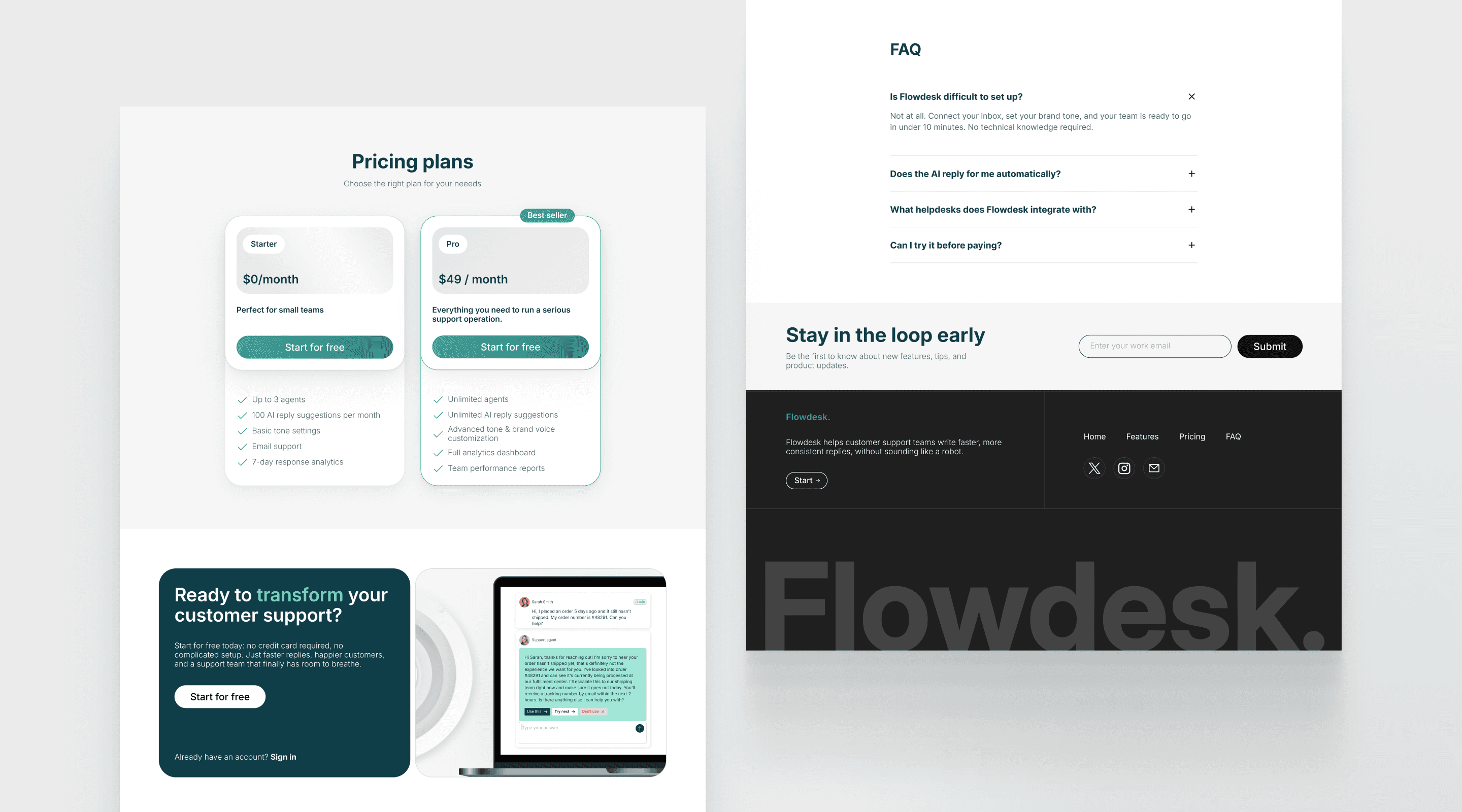
Pricing is structured as a simple two-option choice: free to start, $49/month to scale. The "Best seller" badge on the Pro card nudges toward the higher tier without pressure. Two options is intentional: enough to upsell, not enough to cause decision fatigue.
The FAQ handles the four objections that kill conversions: setup difficulty, AI autonomy, integrations, and cost, placed right before the final push so no doubt reaches the CTA unanswered.
The final CTA pairs a dark card with a real product screenshot showing an actual AI conversation. It reinforces the value prop one last time at the moment of decision. The newsletter section above the footer catches visitors who aren't ready to commit but want to stay connected.

Mobile
The layout adapts cleanly across every section: hierarchy, button sizes, and content order all hold up on a small screen. The full-width CTA buttons and readable type sizes mean the page converts on mobile just as well as on desktop.
Nothing gets hidden or deprioritized. Every section hero, features, how it works, pricing, CTA is fully accessible with a single thumb.

