UX/UI Design
Figma

User Research
Before designing the dashboard, I analyzed leading nutrition apps including MyFitnessPal, Cal AI, Lose It!, Lifesum, and Fastic to understand how users track nutrition and build healthy habits.
The research revealed several common pain points:
Information-heavy dashboards that overwhelm new users.
Too many metrics competing for attention.
Multiple taps required to log a meal.
Unclear next steps after opening the app.
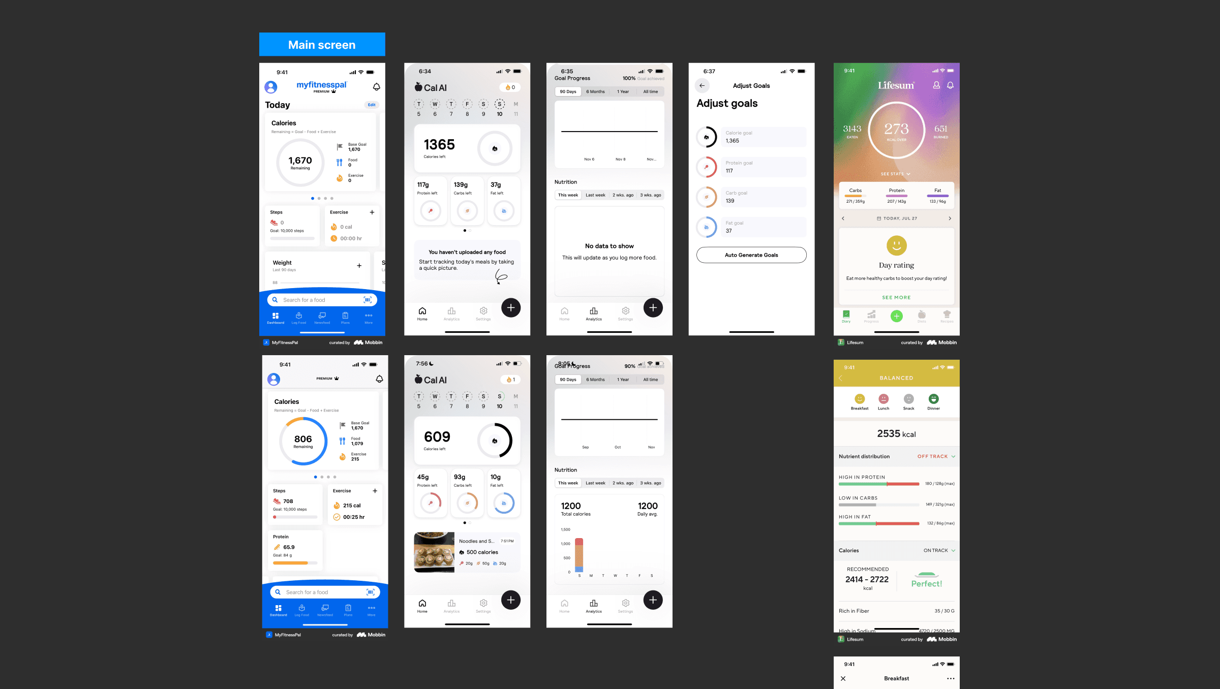
Inspiration & Competitive Analysis
I analyzed how each app presents daily progress, calorie tracking, meal logging, and health insights. This helped me identify the features users expect on a nutrition dashboard while discovering opportunities to simplify the experience.
The research inspired three key design principles for our product:
Surface the most important information first through a clear visual hierarchy.
Make meal logging effortless with quick-access actions.
Keep the interface clean and approachable so users can stay focused on building healthy habits.

Low-Fidelity Exploration
With a tight timeline and a small startup team, we adopted a lean design process. Instead of spending weeks on detailed wireframes, I quickly assembled low-fidelity screens using familiar UI patterns from leading nutrition apps to validate the information hierarchy and user flow.
This approach allowed us to align on the core experience early, iterate rapidly with the team, and move into high-fidelity design without slowing development. The low-fi screens served as a foundation for testing layouts, prioritizing content, and refining interactions before creating the final interface.

Design System
To ensure consistency across the product and speed up development, I created a scalable design system in Figma. It included reusable components, shared styles, and standardized interaction patterns used throughout the app.
The system covered core UI elements such as buttons, navigation, search bars, icons, illustrations, quiz components, input fields, and other reusable interface elements. Building these components early allowed the team to design and develop new features faster while maintaining a consistent user experience across the entire product.

Color & Typography System
Alongside reusable components, I established a shared color palette and typography system to create a consistent visual language across the app. I defined color styles for primary actions, feedback states, backgrounds, and text, as well as typography styles for headings, body text, captions, and labels.
Using shared styles ensured visual consistency, simplified handoff to developers, and made future updates and feature additions faster and easier to maintain.

High-Fidelity Design
Once the information architecture and user flows were validated, I translated the wireframes into a polished interface that reflected the product’s personality.
Instead of following the typical blue-and-white aesthetic used by many nutrition apps, we introduced warm neutral tones, soft greens, and bold black accents to create a distinctive visual identity. The goal was to make the app feel memorable and premium while maintaining the clarity and usability users expect from a health product.
The result is a dashboard that balances functionality with personality, helping the product stand out in a competitive market without sacrificing usability.

Reflection
This dashboard represents only a small part of a much larger product. Over the course of the project, we designed and launched a complete AI nutrition app that has been live for more than a year and continues to serve active users.
Working in a startup environment meant designing quickly, collaborating closely with developers, and continuously improving the product based on real user feedback. Seeing how people interacted with the app helped me better understand which design decisions worked, where users experienced friction, and how small UX improvements could make a meaningful difference.
The experience strengthened my skills in product thinking, user-centered design, and iterative design. More importantly, it taught me that successful UX doesn’t end at launch, it evolves through continuous learning, user feedback, and ongoing refinement.

